Making Static Components Stateful With CSS/Sass

Searching for some red ladies hoodies to wear at your team's event this Fall? How about a purple heathered t-shirt for your group's outing? Last month we launched an exciting change to our product catalog – the ability to filter styles whose color(s) match a simplified name or filter.
Finding your customizable apparel in the right color is now easier than ever. And thanks to our usage of SUIT-based CSS components, along with the ability to leverage existing Rails' fragment caches, the feature was both easy to develop and beneficial to our applications' performance.
Tiny Atomic Component with State
So how did we get there and how do static and stateful CSS components work? What constraints did we face that ended up being performance features? To answer that, let's first have a basic review of a SUIT-based component. We will start small with an atomic pattern, a color swatch. Then work our way upward to the higher UI interface, our product cards.
See the Pen SUIT-based Swatch Component by Ken Collins (@MetaSkills) on CodePen.
Not a lot here, but it does illustrate a key design principle of SUIT, component state. Here, when a swatch gains the is-selected class we show an SVG check mark indicating the change. SUIT's component state will be our main building block for theming other components and turning static HTML/CSS into magically dynamic interactions. In this case, our product cards. Let's have a quick look at what they look like.
Introduction to the ProductCard
See the Pen SUIT-based Product Card Component by Ken Collins (@MetaSkills) on CodePen.
 The HTML for our catalog's listing pages generally follow this format. Each
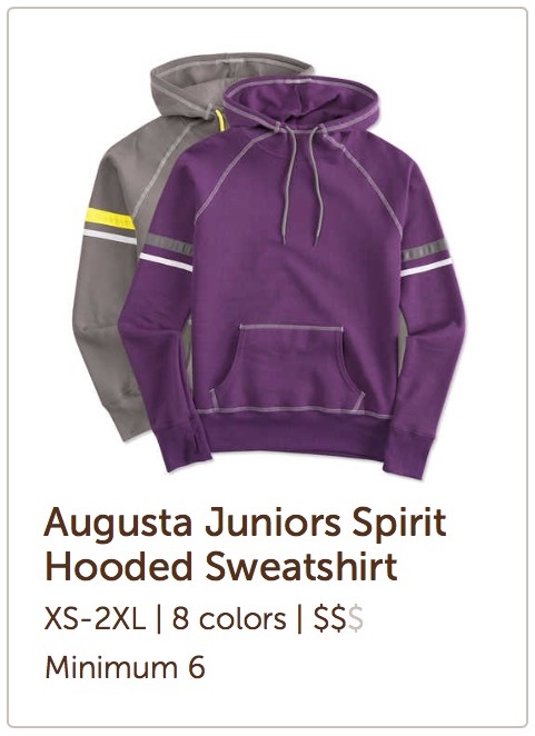
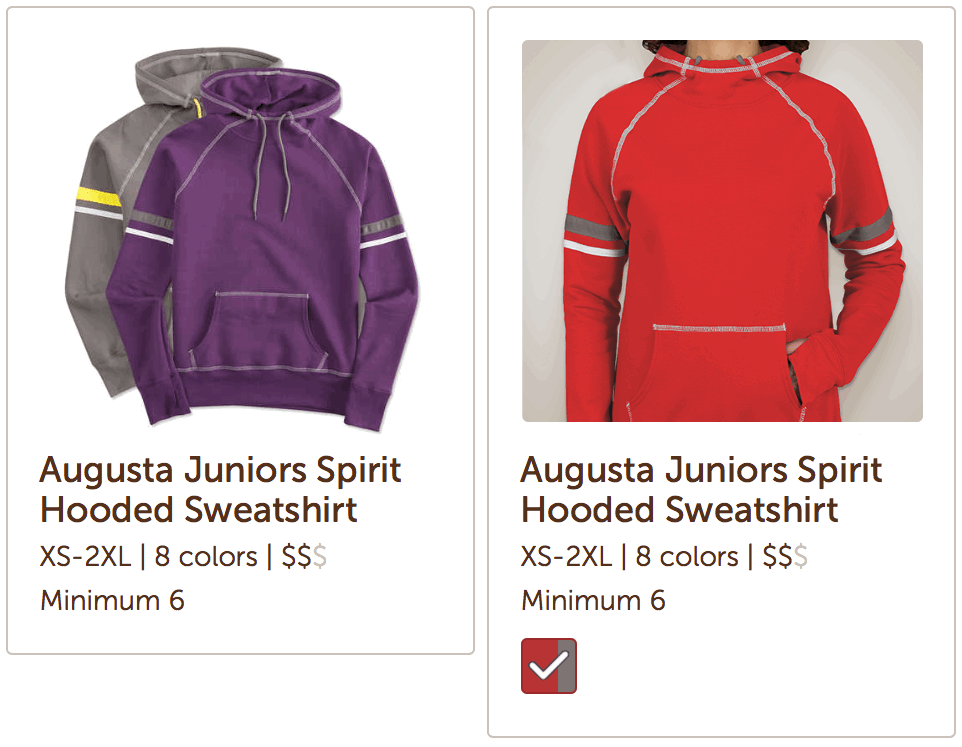
 ProductCard component is a child element inside another higher level presentation component. The image here illustrates the initial state of each product card. Basically a laydown image, title, and misc details.
Each product card <div> is the result of an API call who's HTML is fragment cached. We do all the normal hot stuff like using read multi and pipelining to turn API requests into rendered content. Our goal was to reuse these while still presenting a visually different card when color(s) are selected. The challenge, how to avoid embedding state in each fragment and essentially limited their usage across the catalog.
The answer is simple. Build each card with all of its information, then put the state on the div.Styles-products wrapper component and use that state to theme each card.
The Stateful ProductCard
 Our stateful product cards driven by color filters will be visually different in two ways. First, the laydown image will change to a color-specific one. Second, swatches matching the selected color will appear below the details. This post will focus only on swatches. But the technique is the same for laydown to color images.
<div class="Styles">
  <div class="Styles-products
              is-filteredColor
              is-filteredColor--red">
    <!-- Static Fragments -->
  </div>
</div>
Starting with the HTML, here is our working solution. We are adding SUIT state classes to the wrapper holding all product cards. One indicating that these cards are now being filtered by color and other modifier state(s) which indicate one to many filtered color names. Adding and removing these classes will update any product card's presentation, no JavaScript needed.
Theming with SUIT & Sass
Using SUIT (like BEM) means that component style selectors have a known specificity of only 10. Composing and theming is a simple matter of using the cascade and nested specificity to our advantage.
See the Pen SUIT-based Product Card Component (themed-part1) by Ken Collins (@MetaSkills) on CodePen.
We start off by giving our little atomic color swatch components a happy home within our product cards using a SUIT descendant element/selector. A component's initial presentation is sans-state. So we hide the swatches wrapper. We also start our new .Swatch theme by nesting it inside the card component. The compiled CSS creates a descendant selector ensuring our theme is a) scoped to the component and b) has a specificity equal to 20. Next, giving our cards some stateful presentation.
Adding State-Based Theming
See the Pen SUIT-based Product Card Component (themed-part2) by Ken Collins (@MetaSkills) on CodePen.
This is where the fun starts. I recommend checking the CodePen's compiled view to see how Sass' @at-root works in conjunction with the & operator. What is happening here is that we are theming product cards using the is-filteredByColor state of the content container for all cards within it. The result is not visible yet, but we are un-hiding the swatches container by switching its display back to block. Let's use the same technique for the swatches within.
See the Pen SUIT-based Product Card Component (themed-part3) by Ken Collins (@MetaSkills) on CodePen.
This changes the game entirely. All we have to do now is add state classes to our parent wrapper for one to many colors and it completely changes the interaction of our product cards. The results are magical! Please browse our catalog and check it out for yourself.

Have any questions? Please drop a comment. I would love to share more details of how this works for us and maybe how using state in your CSS can help you too. Cheers!
